Elements
Glass Texture
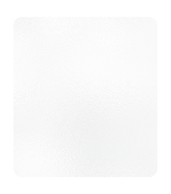
Wescom Resources uses the glass texture as a way to speak to their transparency and honesty.
When used as a design element, the glass texture should have rounded corners, be set to a 15% opacity and have a 60% opacity white layer behind it.
Blurring effects may be added to give the illusion that you are looking through glass.
The glass texture can be used as a background element with text on top of it, or a graphical element woven in with gradient blocks and photography.


You will need the ability to open a .ZIP file to download the glass textures.
Gradient Blocks




Gradient blocks can be used as either a background element or a graphical element layered behind photography.
The blue and orange blocks should be used more predominately, leaving green and cream for special layouts.
Blocks may be turned into different sized rectangles to help create a dynamic layering effect. See example below:

You will need the ability to open a .ZIP file to download the Gradient Blocks.
Connector Lines


Connector lines are used to to show connections between photos and other elements.
The solid line may also be used as a graphical element to separate different sections of content. The diamonds’ corners are slightly rounded, and the stroke should be set to 3 points.
See examples of how to use this element below:

You will need the ability to open a .ZIP file to download the connector lines.
Brandmark-Negative Space

This element is built using the negative space of the Wescom Resources brandmark. It can be used as a background element to add a little texture to a section or area.
You can also use a gradient version, shown below. To achieve this look, use the gradient version of the file, and apply both an overlay blend mode and a 35% opacity to the Brandmark-Negative Space.

You will need the ability to open a .ZIP file to download the Brandmark-Negative Space.
Wescom Resources Texture

The Wescom Resources Texture can be used as a background design element.
You will need the ability to open a .ZIP file to download the Wescom Texture.
Curved Frame Piece


Curved frame pieces may be placed on the top and bottom edges of blocks to create interesting shapes for sections or photos. See example of a section below:

You will need the ability to open a .ZIP file to download the Curved Frame Piece.
Icons
Icons may be used in one color, or may use dark blue to highlight a particular part of the icon. You can also use a circle around an icon to contain the design, when necessary.
When creating new icons for the brand, please use a consistent stroke weight with the current family of icons.
Core & Application Hosting
Teller Line Solutions
Case Studies
Members Served
Years Served
Money Assets
World Class Tech
Tellergy Signature Pad
Automation
Security
Monitoring
Innovators
Growth
Goals
Focus
Flexibility
Alignment
Storage Backup