Logo
Logo Usage
Proper Logo Usage
To ensure consistency, always follow the guidelines outlined here when incorporating the logo into any design.
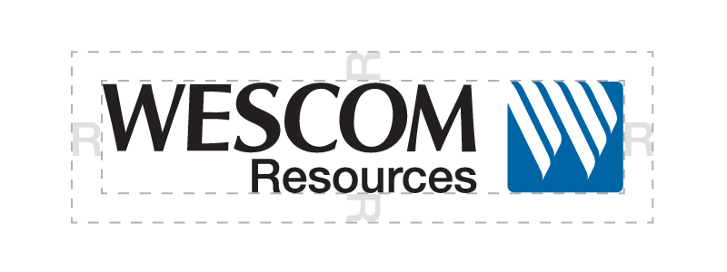
Safe Space
To allow for breathing room and white space around the logo, allow a Resources “R” width around the logo when placing in layouts.
Minimum Size
The size below illustrates the smallest size the logo can go without losing legibility.

What Not To Do
The examples below illustrate ways in which the logo should not be used:
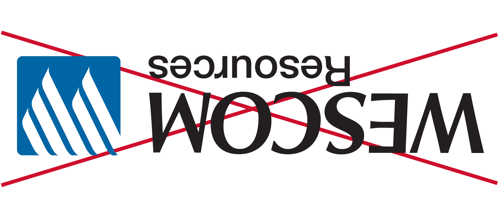
Do not change the logo’s orientation or rotation.
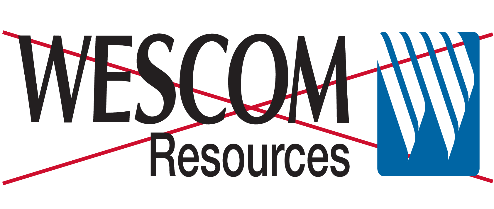
Do not disproportionately scale or resize the logo.
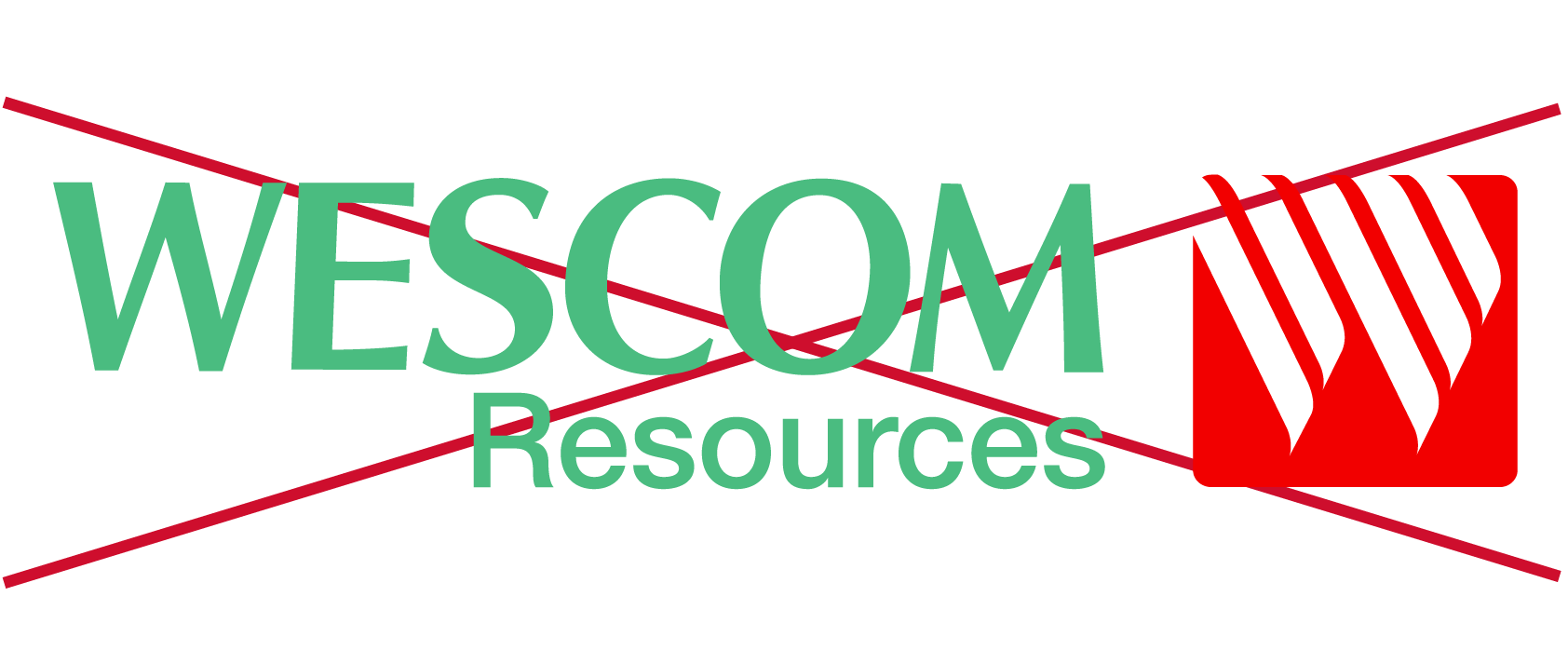
Do not change the logo’s colors.
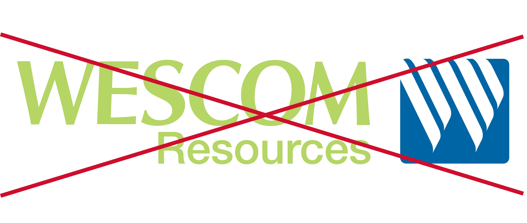
Do not display the logo with color combinations not previously specified.

Do not add an outline to the logo or display the logo as an outline.
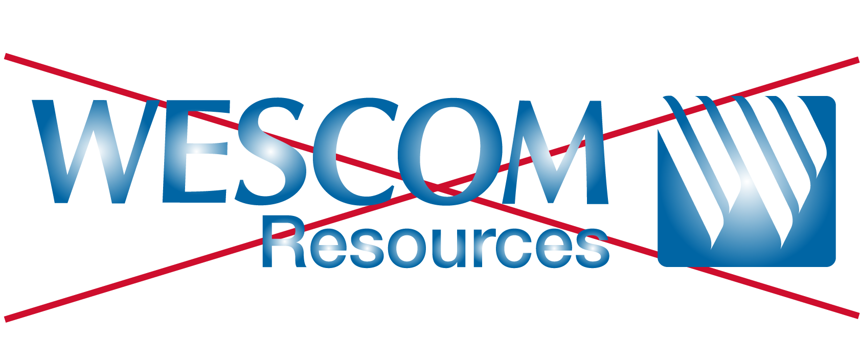
Do not add special effects to the logo.
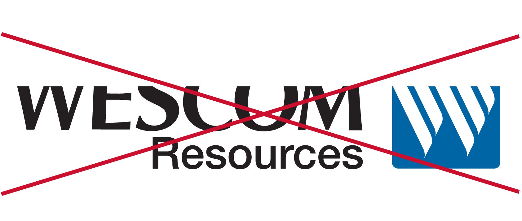
Do not crop the logo in any way.
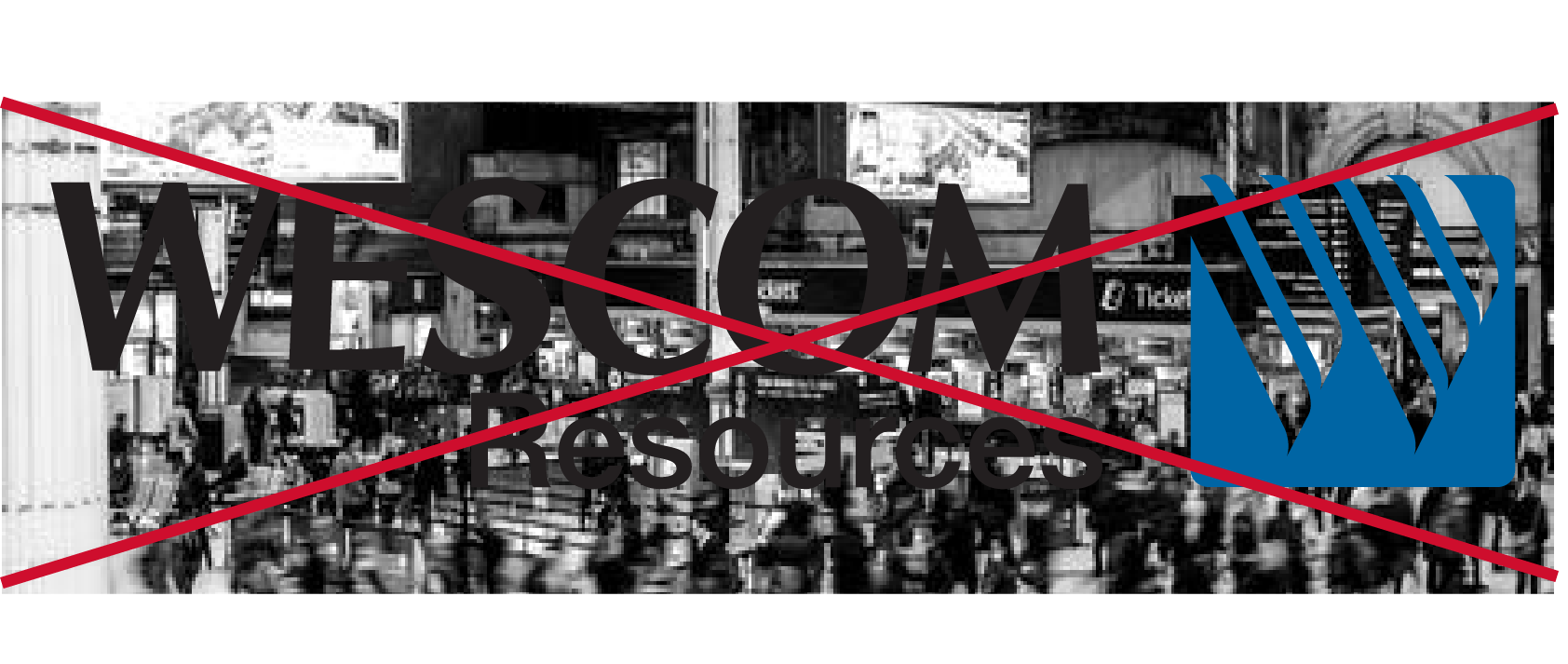
Do not use the logo on top of busy photography.
Logo

Color Variations

Black

White
This download will include files for all primary logo variations in .ai, .eps, .jpg, .pdf and .png formats. To download these logos, you will need the ability to open a .ZIP file.